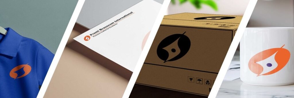
Design & Color Meaning
The orange form reflects energy, speed and forward movement, symbolizing growth and action. The blue core represents trust, stability and technical precision. Together, these colors create a balanced identity that communicates strength with reliability.
Orange
#F26A2E | Energy & Growth
Blue
#4B3A8F | Trust & Precision
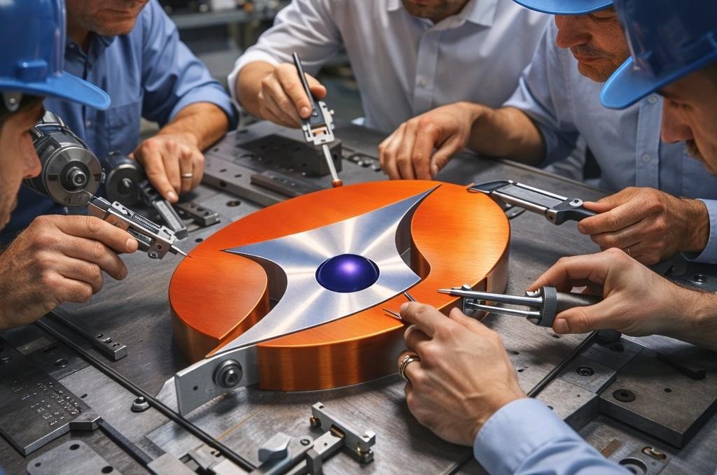
Our Logo : Engineering Identity
Premi Brasscom International nu logo engineering discipline, controlled manufacturing processes ane quality-first approach ne visual form ma represent kare chhe.
Metal Flow Representation
Flowing outer shape brass ane copper alloy extrusion process batave chhe.
Precision Geometry
Sharp internal structure CNC machining ane dimensional accuracy no symbol chhe.
Quality Focus Core
Central element inspection, tolerance control ane QA discipline ne darshave chhe.
Strength & Balance
Balanced form long-term reliability ane process stability batave chhe.